Server crash in September 2017 prompted a fury of activity, and WordPress upgrade was on the top of the list. My site got frozen in time because new upgraded versions on free Magazine Basic lost so much functionality, that I preferred to keep old version rather than loose features.
Top contenders as new theme candidates were MH Magazine and, a few days later, Hueman by Press Customizr. I spend about 10-12 very intense hours (about a week in calendar days) in exploring features and interface of each of these two themes and Hueman began to win the competition. The main reason was that Press Customizr included so much more in a free version, that it seemed more logical to go with that.
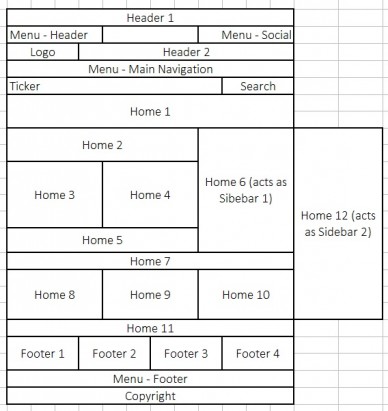 However, when I understood the main organizational unit on MH Magazine – highly customizable home page that you populate with custom widgets – my preference began to shift. And by Saturday, September 23 the decision was made – MH Magazine for $49. You can pay with PayPal. Very few questions asked and you download link is available instantly.
To start customizing, you set a blank WordPress page to be your Home Page (Settings ==> Reading). The main trick here – do not forget to set page template to Homepage.
Conceptual breakthrough: Sidebars 1 and Sidebar 2 areas never show up on home page. On home page they are replaced by Home 6 and Home 12. So, every widget that you put in Sidebar 1 also place in Home 6, and every widget that you place in Sidebar 2, also place in Home 12.
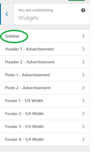
Do not be afraid if you do not see all the Widget areas in your customize sidebar:
 |
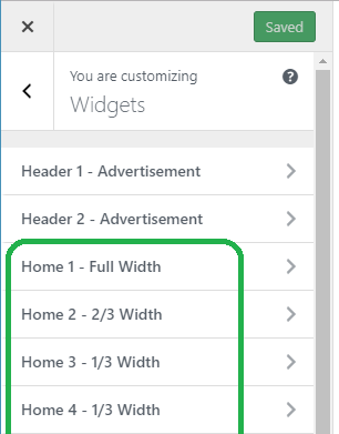 |
| [2017-09-27 WE] When you are on an Archive or a single post page, you will NOT see Home widget areas. | When you are on a Home page, you will see all Home areas, but you will NOT see a Sidebar areas. |
If you set Appearance ==> Theme Layout ==>Layout – General ==> Number of Sidebars ==> Two Sidebars you will see Sidebar 2 area in Archive and Single pages and Home 12 area on Home page. I did not found a way to keep Home 12 area on home page and remove second sidebar on Archive and Single pages.
If you wondering what Archive Layout drop-down box controls, here is a quick reference:
| Archive Layout 1 – proportioned featured image size 326×245 with excerpt to the right of the image – the best nice, clean option |
| Archive Layout 2 – very large featured image with excerpt below the image |
| Archive Layout 3 – same as Layout 1, but with first featured image very large |
| Archive Layout 4 – two columns of posts – looks compact, but too plain |
| Archive Layout 5 – fist featured image very large, next 3 posts in 3 narrow columns, and after that – the same as Layout 1. |
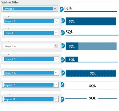
If you are wondering what Widget Title layouts looks like, here is another quick reference:
Exciting discoveries
– register with Gravatar to attach an image to our WP profile. Then display the image with Author Bio widget;
– re-discover for yourself and for your reads long-forgotten posts using RANDOM sort order
– place Ads between archive view posts and on top or bottom of a single post;
– encourage visitor to leave comment by displaying most popular posts in a designated area on your home page
Problems that were solved
– use plugin Resize Thumbnail to mage ugly out on proportions images to play nicely together
– Remove Categories from Archive lists using user interface
–
Problems found so far
– Post without featured images are looking almost like broken links – I would need to do a customization.
– old post used to be a pre-fixed width 779px. And now they get cut off by sidebar on narrow screens.
– Home Forum page for some reason is not loading under MH Magazine, but the rest of bbPress functionality is working. [2017-09-27 WE] update: Forum home page was assigned as “Posts page” is Reading – Static Home Page. As soon As I removed from there, it started to load as expected. [2017-09-28 TH] Your static Home page had to be called Home. Why? Because on breadcrumbs path in bbPress the name of your home page will show up, and it better to be something like “Home”.
– Contact Form 7 page contains a table and I can’t find the way to hide table borders even with border=”0″ attribute.
– Login and Register menu option in Social menu look like icons instead of words. Where social icons appearance is controlled?
Pending customizations
– Pretty bi-lingual Comments template possibly with capture protection
– Custom header logo for one Category all posts in that category
– Search must display result from both post and forum topics
– Show post Date Modified
–


Be the first to comment